
Minnesota travel posters from the early 1900s tell the story of how a state transformed itself into a destination. These vintage designs captured the imagination of travelers and shaped how people saw Minnesota for generations.
At Up North Property Management, we’ve watched how these historical images continue to influence how people view our region today. Whether you’re a collector, history buff, or simply curious about Minnesota’s past, this guide walks you through the artistry and impact of these iconic posters.
How Minnesota Became a Travel Destination
The Railroad’s Strategic Push
The early 1900s marked a turning point when Minnesota transformed from a remote frontier into a sought-after travel destination. This shift did not happen by accident. The Great Northern Railway and Northern Pacific Railroad actively promoted Minnesota to wealthy travelers across the country, flooding East Coast newspapers and magazines with advertisements that featured pristine lakes, dense forests, and the dramatic North Shore. These railroads understood that more passengers meant more revenue, so they invested heavily in posters that made Minnesota irresistible.
Government and Industry Partnership
The Minnesota Board of Immigration, established in 1858, worked alongside these rail companies to amplify the message. Together, they created a coordinated marketing push that positioned Minnesota as the ideal escape for urban professionals who sought outdoor adventure and natural beauty. Between 1900 and 1930, this promotional machine produced thousands of posters that circulated through train stations, hotels, and travel agencies.
Strategic Design and Market Research
The designs were not random. Artists deliberately emphasized specific features-the 10,000 lakes, the pristine wilderness, and Lake Superior’s rugged coastline-because market research of the era showed these elements attracted affluent tourists willing to spend money on extended stays. The most successful posters featured bold typography and vibrant colors that stood out in crowded spaces. Artists like Edward Penfield and other commercial illustrators developed a distinctive Minnesota aesthetic that became instantly recognizable.
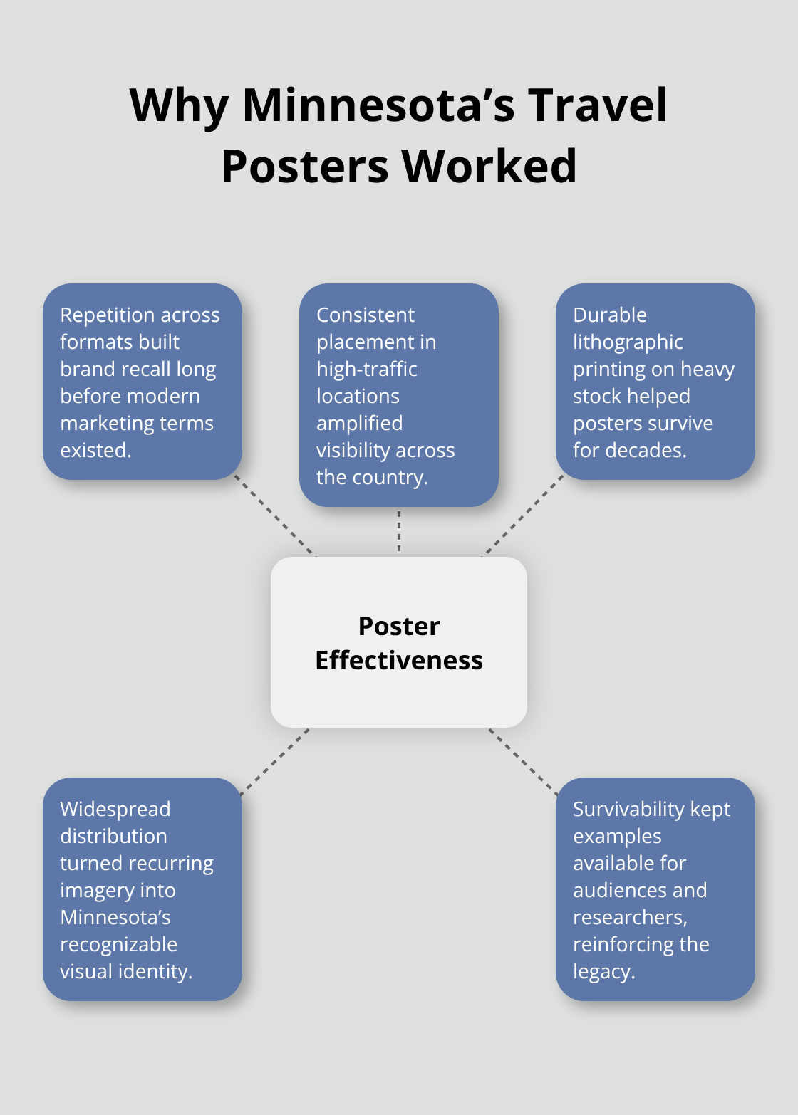
Repetition and Brand Building
What made these posters effective was not artistic ambition alone but strategic repetition and placement. The same images appeared across multiple formats and locations, creating brand awareness decades before modern marketing terminology existed. The quality of materials used-lithographic printing on heavy stock paper-ensured many survived to the present day, making them accessible to anyone interested in how state promotion actually worked in practice. This combination of durability and widespread distribution transformed Minnesota’s image across America and established the visual language that still defines the state’s identity today.
What Made These Posters Sell Minnesota
The North Shore’s Visual Power
The North Shore and Lake Superior dominated Minnesota travel posters for a simple reason: they worked. Split Rock Lighthouse appeared on hundreds of designs throughout the early 1900s because tourism data from the era showed visitors traveled specifically to see this landmark. The dramatic red and white structure stood out visually and represented something wealthy East Coast travelers craved-rugged, untamed nature within reach of a train ride. Artists like Edward Penfield understood that Lake Superior’s rocky shoreline and the region’s isolation created compelling imagery that photographs alone could not convey.
How Posters Transformed Minnesota’s Status
These posters transformed a remote region into a status symbol. Owning a Minnesota travel experience meant you had the resources and sophistication to escape urban life. The posters showed pristine waters, dense forest, and dramatic geological formations rendered in vibrant color combinations that modern design still struggles to replicate. What collectors often miss is that these were not artistic experiments-they were calculated sales tools. The railroads tested different designs, tracked which ones drew the most inquiries, and reproduced winners across multiple print runs. This is why certain images appear repeatedly in collections today.
Strategic Visual Messaging
The 10,000 lakes claim became visual shorthand for Minnesota’s natural abundance, appearing on posters alongside fishing imagery and resort advertisements. Forest landscapes emphasized solitude and escape rather than commercial development, which resonated powerfully with city dwellers facing industrial crowding. The railroads made deliberate choices about which natural features to highlight and which to omit, signaling that they explicitly targeted leisure travelers rather than settlers or business investors.
Tourism’s Economic Ripple Effect
The success of these posters fundamentally rewired Minnesota’s economy and identity. Tourism revenue grew significantly between 1900 and 1930 as these designs pulled travelers northward, creating demand for hotels, guides, and transportation services that transformed small towns into vacation destinations. Towns featured prominently on posters received more visitor traffic and investment capital. The posters created a feedback loop where visual representation led to actual tourism, which led to infrastructure development, which validated the imagery and encouraged more travel. This cycle demonstrates that vintage Minnesota travel posters are not simply historical artifacts-they are evidence of how marketing shapes reality.
The Lasting Design Legacy
Color palettes from 1920s posters appear in contemporary tourism materials, resort branding, and vacation rental marketing. The specific aesthetic choices made in these designs still influence how people perceive Minnesota today. Understanding which natural features received artistic attention reveals what early promoters believed would attract spending visitors. Lake Superior’s dramatic geology received far more attention than Minnesota’s agricultural heritage, a choice that continues to shape the state’s identity and how visitors experience the region.
Building Your Minnesota Travel Poster Collection
Where to Find Authentic Vintage Posters
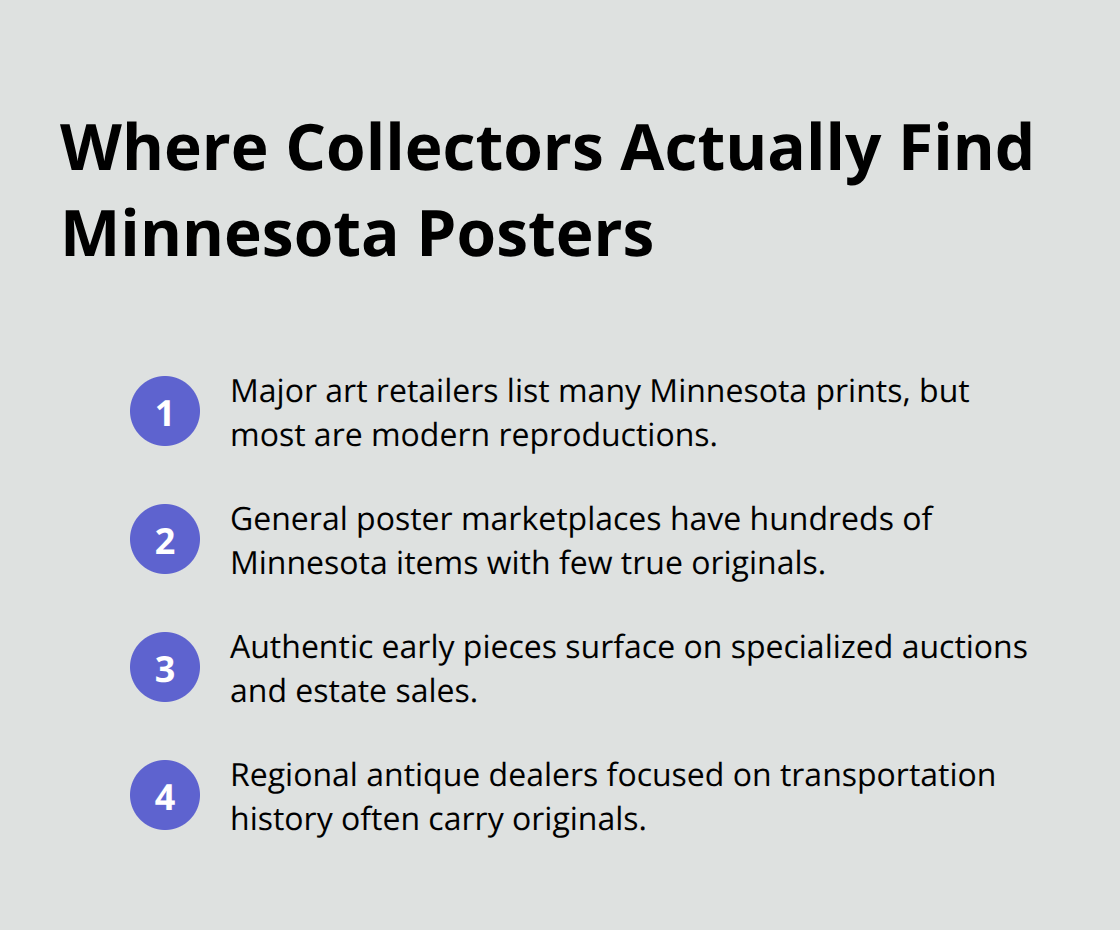
Sourcing authentic vintage Minnesota travel posters requires knowing where collectors actually find quality pieces rather than reproductions flooding online marketplaces. Art.com lists 49 Minnesota travel ad prints, though most are modern reproductions styled after vintage designs rather than originals from the 1900s and 1920s. AllPosters carries 698 Minnesota-related items across multiple categories, but again, the vast majority are contemporary prints manufactured to look vintage. Genuine early posters appear sporadically on specialized auction sites, estate sales, and regional antique dealers who focus on transportation history and Americana.
Distinguishing Authentic Pieces from Modern Reproductions
The key distinction separates what looks vintage from what actually is vintage. Original lithographic posters from the railroad era feature specific characteristics: the paper stock shows age with subtle yellowing or foxing, the ink sits slightly raised on the surface rather than completely flat, and the printing techniques produce subtle color variations that digital reproduction cannot replicate. Museums like the Minnesota History Center maintain collections you can inspect in person to train your eye for authenticity before spending significant money.
Prices for authentic early posters range dramatically based on condition and rarity, with common designs selling between $200 and $800, while exceptional pieces featuring Split Rock Lighthouse or rare artist signatures command $1,500 to $4,000 or higher. The most common mistake collectors make involves confusing nostalgic modern prints with genuine antiques. Contemporary reproductions on semi-gloss or matte paper lack the weight and finish of period-correct materials. Examining the back of a poster reveals production details that expose modern reproductions immediately. Genuine vintage posters show printing registration marks, publisher stamps, or hand-written notations from previous owners, whereas modern reproductions show only uniform backing paper.
Optimal Storage Conditions for Preservation
Storage conditions determine whether your collection appreciates or deteriorates. Temperature stability between 60 and 75 degrees Fahrenheit with humidity maintained between 30 and 40 percent prevents paper degradation, mold growth, and ink fading. Direct sunlight causes irreversible color loss within months, making interior wall placement far superior to high-traffic hallways or entryways receiving constant natural light.
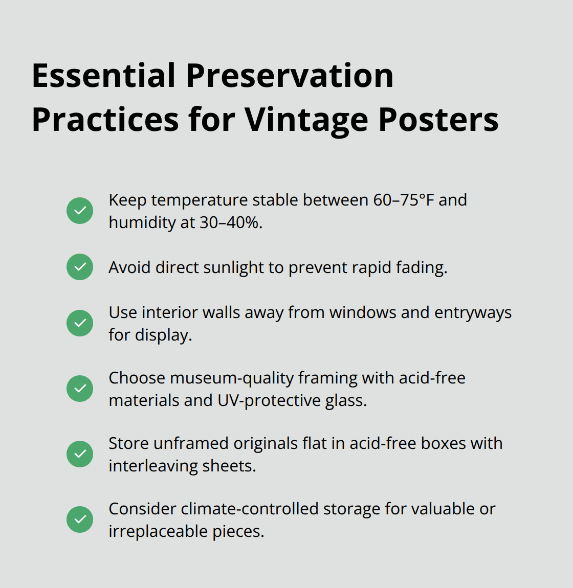
Framing choices matter significantly for preservation. Museum-quality framing uses acid-free matting and UV-protective glass that shields artwork from fading while preventing yellowing and degradation over time. The retro posters sold through vendors like Etsy use FSC-certified paper and sustainable inks, which differ from original 1920s materials but represent the modern standard for quality reproductions. Storing unframed originals requires acid-free storage boxes, interleaving sheets between pieces, and flat storage rather than rolled positioning that creates permanent creases. Climate-controlled storage facilities cost $30 to $100 monthly but protect irreplaceable pieces far more effectively than basements or attics where temperature and humidity swing wildly.
Strategic Display and Rotation Practices
Displaying your collection strategically enhances both visual impact and preservation. Grouping three posters together creates stronger visual presence than scattered individual pieces, with the landscape orientation dominant among Minnesota designs allowing flexible arrangement options across wall spaces. Collectors who rotate displayed pieces quarterly reduce light exposure damage while maintaining variety in their living spaces.
Professional conservation services exist for damaged originals, though costs range from $200 to $1,000 depending on restoration requirements, making preventive storage and display practices substantially more cost-effective than repair after damage occurs.
Final Thoughts
Minnesota travel posters shaped how the world perceived this state for over a century, and that visual identity persists today. The bold colors, dramatic landscapes, and carefully chosen imagery established Minnesota as a destination for people seeking authentic natural beauty and escape from urban life. Modern visitors still travel to Split Rock Lighthouse, still fish Minnesota’s lakes, and still seek the solitude that early posters promised because the vintage designs captured something genuinely real about the region.
What makes a Minnesota travel poster resonate across generations is its honesty about what the state offers. The railroads promoted genuine attractions-the North Shore’s geology, the forest’s density, the water’s clarity-rather than fabricated amenities, and contemporary tourism marketing still relies on these same visual elements today. The color palettes, composition choices, and subject matter from the 1920s appear in resort branding, vacation rental photography, and state tourism campaigns because they work.
For collectors and history enthusiasts, these posters represent tangible evidence of how places transform themselves through strategic storytelling, and owning an authentic piece connects you directly to Minnesota’s tourism history. If you’re considering a Minnesota vacation or exploring property ownership in the region, Up North Property Management specializes in vacation rental management throughout Northern Minnesota, handling everything from marketing and bookings to maintenance and guest services.